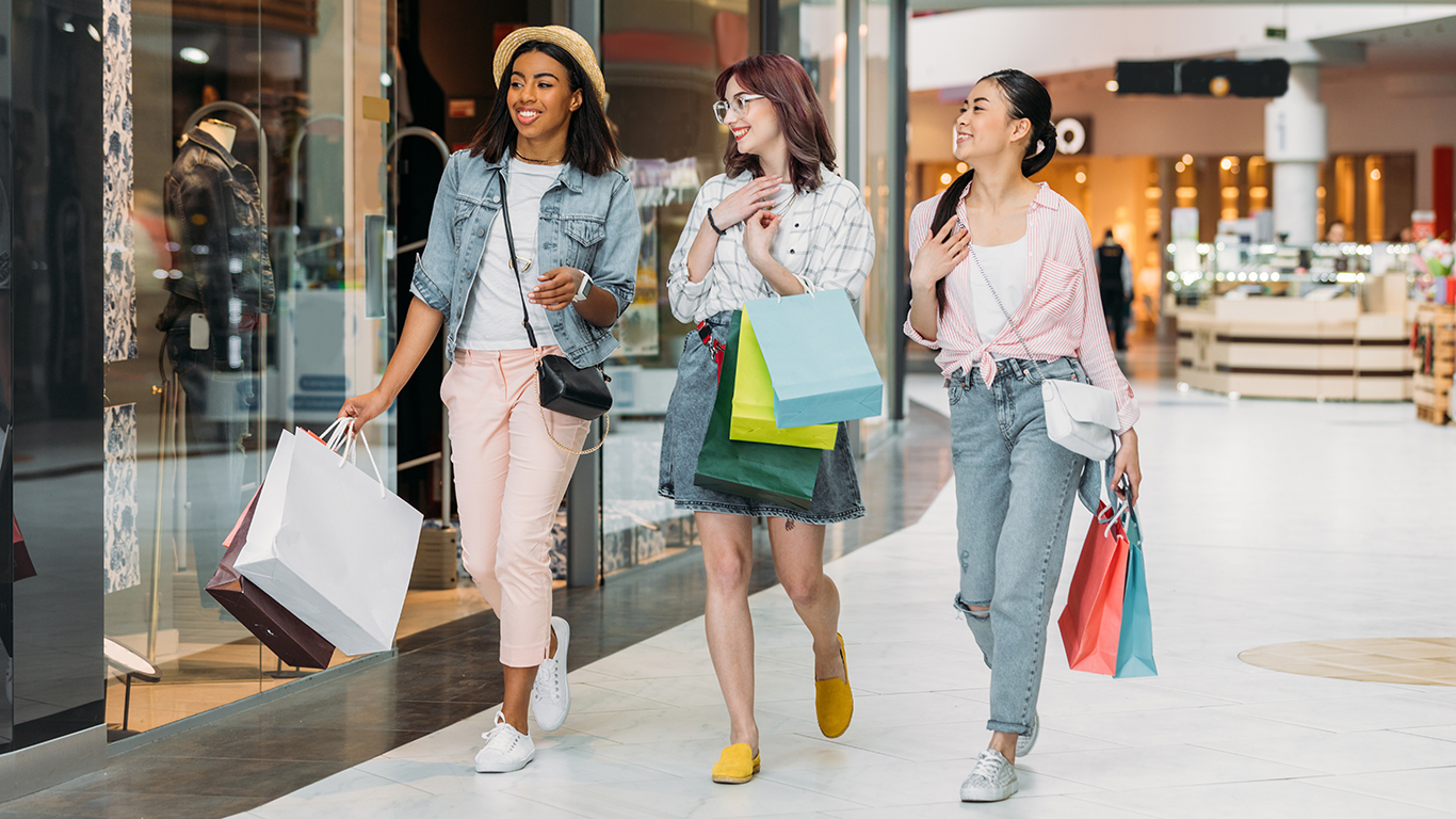
A customer who walks in, circles once, and leaves is not always rejecting the product. Sometimes the space gives them no reason to slow down. The lighting feels harsh, the seating looks temporary, the path is confusing, or food and rest areas feel like afterthoughts instead of part of the visit.
Layout That Makes Movement Easy
Customers stay longer when they can understand a space without asking for help every few minutes. Clear paths, visible entrances, obvious ordering points, and natural stopping areas reduce the small irritations that make people cut a visit short.
A good layout does not push everyone into one tight route. It lets a parent step aside with a child, gives friends room to browse without blocking traffic, and helps new visitors find the bathroom, counter, or exit without scanning every wall. Retail designers have noticed that dedicated gathering spaces can extend shopping trips, especially when people are not forced to choose between buying something and simply being comfortable for a few more minutes.
Seating That Signals People Can Stay
Hard benches and awkward stools tell customers the business wants quick turnover. Softer seating, mixed table sizes, and a few tucked-away spots send a different message. People linger when their bodies are not being rushed out the door.
The seating plan should match how customers actually use the space. A cafe near a family attraction may need tables that handle snacks, bags, and tired kids. A boutique may need a chair for the friend who is waiting. A lobby may need one quiet corner where a customer can answer a message without feeling in the way.
Food Built Into the Visit
Customers often leave because someone gets hungry, not because the main experience is over. Food areas can extend a visit when they are placed where people naturally pause, with clear sightlines and enough seating to prevent the space from feeling like a separate errand.
At the Tree House Cafe, food becomes part of the customer path rather than a reason to leave the building, which is exactly the kind of design choice that matters in family-focused venues. Adults get a break, kids get refueled, and the visit can keep going without everyone packing up early.
DEEPER DIVE: Read all the Ranking Arizona Top 10 lists here
INDUSTRY INSIGHTS: Want more news like this? Get our free newsletter here
Lighting That Changes the Pace
Bright, flat lighting may help with cleaning and visibility, but it can make a space feel cold if it is used everywhere. Layered lighting gives different zones different jobs. A brighter counter helps customers order quickly, while warmer seating areas invite a slower pace.
Restaurants and quick-service spaces have long used lighting, color, and seating to influence how quickly guests move through a room, and seating comfort changes how long people stay more than many owners realize. The goal is not to trap customers. It is to make the parts of the visit meant for lingering feel different from the parts meant for movement.
Details That Remove Friction
A customer who cannot find a trash can, outlet, menu, stroller space, or pickup shelf starts mentally checking out. These small details rarely appear in glossy design photos, but they decide whether the space feels easy to use.
The most useful fixes are often simple:
- Put signs where people hesitate, not where staff already know the answer
- Keep walkways wide enough for groups, bags, wheelchairs, and strollers
- Place trash cans and napkins near food areas instead of hiding them
- Give waiting customers somewhere to stand without blocking the next guest
Commercial design works best when it respects how people behave once they are inside. Customers stay longer when the space helps them move, pause, eat, wait, and rejoin the experience without friction. That kind of comfort does not feel flashy, but it is often what turns a quick stop into a longer visit.