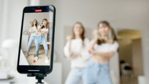
I run a YouTube channel in the eighty-thousand-subscriber range. Not huge, not tiny, the kind of size where you start making real money but cannot quite afford to outsource everything. For most of the last two years, the single biggest hole in my workflow has been thumbnails. Every other part of making a video — scripting, shooting, editing, even SEO — I had a working system for. Thumbnails were just chaos.
I would finish editing a video at midnight, realize I still needed a thumbnail, open Photoshop, fight with stock images for an hour, slap some bold text on a photo of my face, and publish. The next morning I would look at my channel page and see twenty thumbnails that all looked like they came from twenty different channels. Different fonts. Different color palettes. Different facial expressions. Different vibes. No coherence whatsoever.
For a while I assumed this did not matter. The data eventually proved me wrong.
Why a Consistent Channel Look Quietly Drives Growth
YouTube’s algorithm rewards click-through rate, and click-through rate is heavily influenced by recognition. When a subscriber scrolls past your thumbnail on their home page, they decide in about half a second whether to click. Half of that decision is the title and half is the thumbnail. And the thumbnail is doing more than telling them what the video is about — it is also signaling whether this is a video from a channel they already trust.
Channels with consistent thumbnail design get clicked on much more often by returning viewers. The viewer recognizes the look before they read anything. It is the visual equivalent of a familiar voice. Channels with chaotic thumbnails make every video feel like a stranger’s video, even to people who already subscribe.
I noticed this in my own behavior first. There were certain channels whose thumbnails I could spot at a glance because they always used the same color treatment, the same kind of face composition, the same typography. I clicked on those channels’ videos almost reflexively. There were other channels I subscribed to whose thumbnails were so varied that I never recognized them in my feed, and I rarely clicked. My own channel was the second kind.
The Old Way of Making Thumbnails Was Killing Me
Before Nano Banana entered my workflow, every thumbnail was a one-off. I would search for stock photos that approximated what I wanted, fail to find them, take a quick selfie with the exaggerated expression the algorithm seems to like, fight with the background removal tool to cut myself out cleanly, paste myself onto whatever backdrop I cobbled together, and add text on top. Total time: an hour and a half if everything went well, three hours if I got stuck.
Three hours of thumbnail work after editing a video had already drained me felt insulting. The thumbnail is the single most important visual asset of the entire video, and I was treating it like an afterthought because I had nothing left in the tank by the time I got to it.
The other problem was that even when I tried to be intentional, I could not maintain a consistent style across videos. I would have a great-looking thumbnail one week and a mediocre one the next. The expression on my face would be slightly different. The color grading on the background would shift. The typography would creep around depending on what looked good against that specific image.
What Changed When I Started Using Nano Banana for Thumbnails
The first time I tried using Nano Banana for a thumbnail, I was looking for a way to put myself in a scene that did not exist. The video was about a topic that needed a dramatic visual backdrop, and I did not have stock footage that worked. I uploaded a clean photo of myself and asked for the same person, same shirt, same expression, but standing in front of a glowing wall of monitors with cinematic blue lighting. What came back was usable on the first try, which had never happened to me with a thumbnail before.
What really hooked me, though, was the next thumbnail. I generated a new scene for the next video — a completely different topic, but I asked for the same color treatment, the same lighting style, the same overall mood — and the two thumbnails actually looked like they came from the same channel. Two different topics, two different backgrounds, but visually unified.
That was the unlock. I was not just generating thumbnails faster. I was building a channel look that I could maintain indefinitely, regardless of what the video was about.
How Channel Consistency Actually Works in Practice
The way I think about thumbnails now is closer to how a magazine thinks about covers. Every issue of a magazine is about a different topic, but every cover follows a template. Same logo placement, same typography family, same general color treatment, same kind of focal subject. That visual template is what makes the magazine recognizable on a newsstand.
YouTube thumbnails work the same way. The template is not a literal template you fill in. It is a set of visual rules: this is my color palette, this is my typography, this is the lighting style I use, this is how I compose my face in the frame, this is the saturation level. When every thumbnail follows those rules, subscribers see your thumbnail in their feed and recognize it as yours before they read a single word.
Nano Banana made this kind of template thinking possible for me because I can write the visual rules into a style description and apply that description to every thumbnail I generate. A bright but slightly desaturated palette. Cinematic side lighting. A clear focal subject in the right two-thirds of the frame. Background depth-of-field blur. That description goes into every prompt, and every thumbnail comes out feeling like it belongs to the same channel.
The Face Problem and How to Solve It
Most YouTube thumbnails feature the creator’s face, and most YouTube creators are not photographers. Getting a clean, well-lit, expressive photo of yourself for every thumbnail used to mean either setting up a studio in your apartment or accepting that half your thumbnails would have you in bad lighting.
The Nano Banana workflow that works for me is this. I shoot one really clean, well-lit photo of myself in a neutral pose with a neutral expression, in good lighting, against a plain background. That photo becomes my reference. Then for every thumbnail, I generate variations — the same face, but with different expressions, different angles, different lighting moods, dropped into different generated scenes.
The key is character consistency. The face that appears in my thumbnails has to actually look like me, not like a slightly different person each time. Earlier generative tools could not handle this well. Nano Banana keeps the face recognizable across dozens of generated thumbnails, which is what makes the whole approach work.
What I Still Do Manually
I do not want to oversell this. There are parts of thumbnail design that AI is not great at yet, and pretending otherwise would just embarrass me when you tried to copy the workflow.
Text on thumbnails is one of those parts. While generative tools have gotten much better at rendering text, the actual typography decisions — what font, what size, what color, where on the frame, what weight — are still better handled in a real design tool. I generate the background and the face inside Nano Banana, then drop the result into Figma to add the text and final polish.
Color correction at the end is another manual step. Even with a consistent style description, generated images sometimes drift slightly in saturation or contrast. I run every thumbnail through a quick color correction pass to make sure the new thumbnail matches the look of the last twenty thumbnails on my channel page.
A/B testing is another. Generating variants is fast now, but you still have to test them. YouTube Studio’s thumbnail testing feature is where I make the final call on which variant ships.
DEEPER DIVE: Read all the Ranking Arizona Top 10 lists here
INDUSTRY INSIGHTS: Want more news like this? Get our free newsletter here
A Realistic Timeline for a Thumbnail Now
Before this workflow, a single thumbnail took me ninety minutes to three hours. Now a single thumbnail takes me about twenty minutes. I generate three or four variants in Nano Banana, pick the strongest one, drop it into Figma, add the typography, do a quick color pass, and ship.
The time savings matter, but the consistency matters more. My channel page now actually looks like a channel page. Subscribers tell me my thumbnails are “instantly recognizable” — words that used to apply to channels I admired and not to mine.
My click-through rate over the last six months has climbed from around four percent to just over seven. Some of that is better titles and better videos. A lot of it, based on the per-thumbnail data, is the consistency itself. Returning subscribers click more often. New viewers form a brand impression faster.
Why This Matters More Than People Admit
YouTube creators talk endlessly about content strategy, niche positioning, and algorithm hacks. They talk much less about visual identity, even though visual identity might be the single most underrated growth lever on the platform.
The reason it gets underrated is that until recently, building a real visual identity required either a designer on retainer or a creator who happened to also be a designer. Most of us were neither. We made do with whatever we could throw together at midnight after editing, and our channels suffered for it without anyone really articulating why.
Nano Banana has not made me a designer. But it has given me access to the visual consistency that designers used to be required for, and it has done so on a timeline that fits around making actual videos. That feels like the meaningful change for small and mid-sized creators — not the existence of AI generally, but the specific point where AI got reliable enough to maintain a channel’s visual identity across every upload without exhausting the creator behind it.