You know how it is: You snap what appears to be a perfect picture, and then, when you look at it on your computer, something’s not quite right. The skin looks a little gray. Greens turn neon. A sunset feels cold when you open the file. Colors are crucial to a successful picture, but is there any way to recover them and breathe life back into your image? Sure, that’s what we’re going to talk about.
LUTs (Look-Up Tables) help you fix that faster. Think of them as ready-made color recipes. You apply one, and it consistently shifts tones, contrast, and overall mood. If you know how to use LUTs, you can save time and achieve cohesive looks without guesswork.
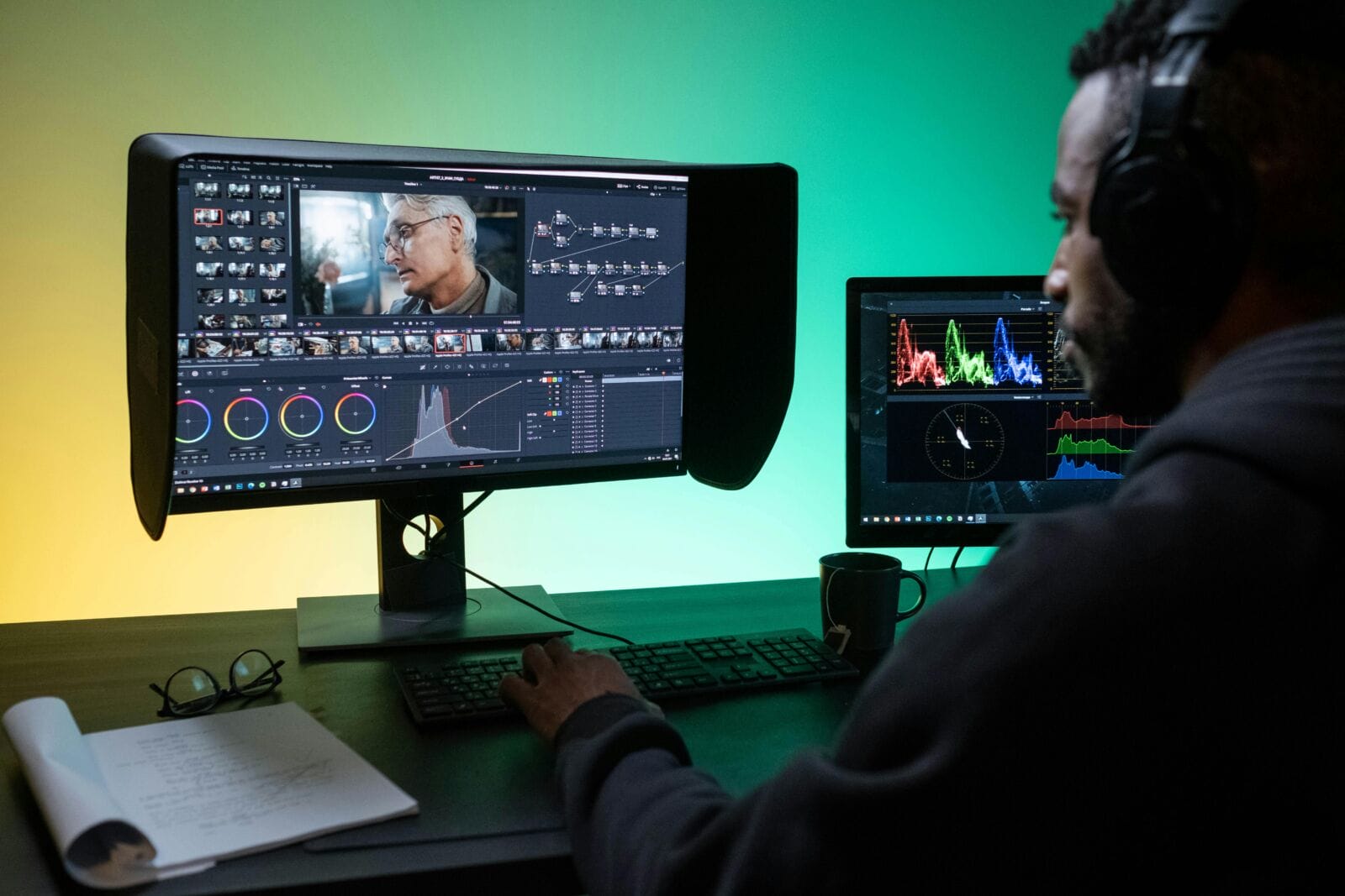
This guide shows a simple, step-by-step way to improve color. If you’ve ever spent too long nudging sliders and still felt unsure, this workflow will set the way for you.
Step 1: Set the Baseline
LUT color grading is most effective when you have a clean, believable baseline. Here is how to do it in the post-processing software like Luminar Neo:
- Set the exposure. Ensure your picture is neither too light nor too dark. The important details should not be obscured or blown out in bright areas.
- Correct the white balance. Find a reliable neutral. It can be a white shirt, a gray wall, or a tabletop. If your neutral looks yellowish or blueish, adjust the color temperature until it looks realistic.
- Stabilize contrasts, aiming for balanced midtones. If you push the slider too far, your further edits will look harsh.
- Choose a hero image from the set to align the rest of your gallery with it and maintain consistency.
- Zoom in on skin and whites for five seconds before moving on. If those look believable, you are done.
Step 2: Choose the Right LUT
LUT photography becomes much easier when your LUT pack matches three criteria: your light, your subject, and your goal.
If the picture was taken in soft window light, begin with LUTs that say “soft,” “film,” or “natural.” If you’re shooting under harsh sun, choose one that protects the highlights and doesn’t over-boost saturation. For portraits, focus on LUTs that keep skin tones from being too unnatural. For landscapes, you can go a little more nuts with contrast and color generally, particularly for greens and blues.
Here’s a simple thing you can do to protect yourself from bad choices: apply the LUT, and then look at two things straight away: skin (maybe a neutral on an object), and the brightest part of your frame. If one of them is off, skip this LUT.
Step 3: Apply the LUT
A successful color grading means treating your LUT as a creative direction you can later dial in to match your intended aesthetics. This is what differentiates LUTs from presets — customization and control.
Start by lowering LUT intensity (or opacity) until skin, skies, and whites look believable again. If the LUT makes the image feel heavy, lift midtones slightly. If it washes everything out, add a touch of contrast after the LUT. After the LUT, not before, because you are tweaking the LUT according to your needs instead of using it in the hope of covering your basic adjustment mistakes.
If faces look too warm, reduce saturation a bit or cool the white balance by a small step. Suppose neutrals shift to green or magenta; nudge the tint until they settle. Adjust highlights so they don’t clip, and raise the shadows slightly so they don’t block up.
Step 4: Shape the Mood
Make a creative decision. Do you want the photo to feel warm and inviting, cool and minimal, or bold and dramatic? Then change one thing to back up this choice. To help maintain warmth, raise midtones a tad and leave shadows natural. To give the look a cooler feel, drop highlights a tad and desaturate blues. For drama, layer inky blacks selectively, shielding skin and bright details.
Compare your edited image to the unedited one for two seconds. If you feel like the scene changed locations or time of day, dial back and reapply the adjustment with a lower opacity. Apply the same LUT and the same “mood” adjustment across the group if you work with big projects.
Step 5: Make It Repeatable
Apply the same LUT and tweaks you liked most on your hero image. Save the adjustments as a preset in your editor to make them reusable. Next, apply the preset to the rest of the set, then only adjust what truly changes from frame to frame. Usually, it is exposure and white balance. Then, check whether your gallery looks consistent:
- Compare three frames: the brightest, the darkest, and one portrait (or a neutral object).
- Look at whites, skin, and shadows. If any of those drift, fix it once in the preset or lower LUT intensity across the set.
- Zoom out and scan the gallery view. If one image “shouts” compared to the rest, it usually has too much contrast or saturation.
Conclusion
Incorporating LUTs into your color correction and grading workflow streamlines the editing process and ensures a cohesive and professional look across your images. By mastering the use of LUTs, you can transform your photos from lackluster to vibrant, allowing your creative vision to shine through with precision and ease.