Creating banners should feel simple, fun, and stress-free. A great banner helps share messages clearly with everyone watching. People use banners for parties, school events, sports, and shops.
Colors, words, and images must work together to feel exciting. Many people feel confused when design tools seem hard. What if making banners could feel easy and enjoyable?
Custom banners help events feel special and well planned. Good designs help messages stay clear and friendly. Anyone can design banners with the right guidance today.
This guide explains how custom banner designs become simple. Keep reading to discover easy banner design solutions.
Understanding the Purpose of Every Banner Design
Every banner starts with a clear purpose and simple message. Knowing the goal helps shape colors, text, and images. Some banners inform people about events, dates, or locations.
Others invite people to celebrate birthdays, weddings, or school programs. Business banners often share sales, openings, or special offers. When purpose feels clear, design choices become easier.
Short messages work better because people read quickly. Large fonts help words stay readable from far away. Images should support the message, not distract viewers.
Thinking about who will see the banner also matters. Children, adults, or customers notice different design styles. Matching design with purpose builds strong communication.
A focused banner feels organized and pleasant. Clear purpose prevents clutter and confusion. Simple planning always improves banner results.
Choosing Colors That Match the Occasion Perfectly
Colors play a big role in banner design success. Bright colors feel fun for birthdays and school activities. Soft colors work well for formal events and calm settings.
Businesses often use brand colors to stay recognizable. Too many colors can confuse people quickly. Choosing two or three main colors works best.
High contrast helps text stand out clearly. Dark text on light backgrounds improves readability. Light text on dark backgrounds also works well.
Seasonal events often follow familiar color themes. Red and green feel festive during holidays. Pastel shades feel gentle for baby celebrations.
Color choices affect emotions and attention strongly. Smart color use keeps banners balanced and attractive. Good color planning makes banners easier to understand.
Writing Clear Messages That People Read Quickly
Banner messages should stay short and easy to read. People usually glance at banners for a few seconds. Using simple words helps everyone understand quickly.
Avoid long sentences that slow reading speed. Big headlines grab attention immediately. Small supporting text adds helpful details below.
Dates, times, and locations must appear clearly. Spacing between words improves reading comfort. Capital letters work well for short titles.
Too many fonts can feel messy and confusing. One or two font styles feel cleaner. Friendly language helps banners feel welcoming.
Clear messages make banners effective communication tools. Good wording saves time for readers. Simple writing always improves banner impact.
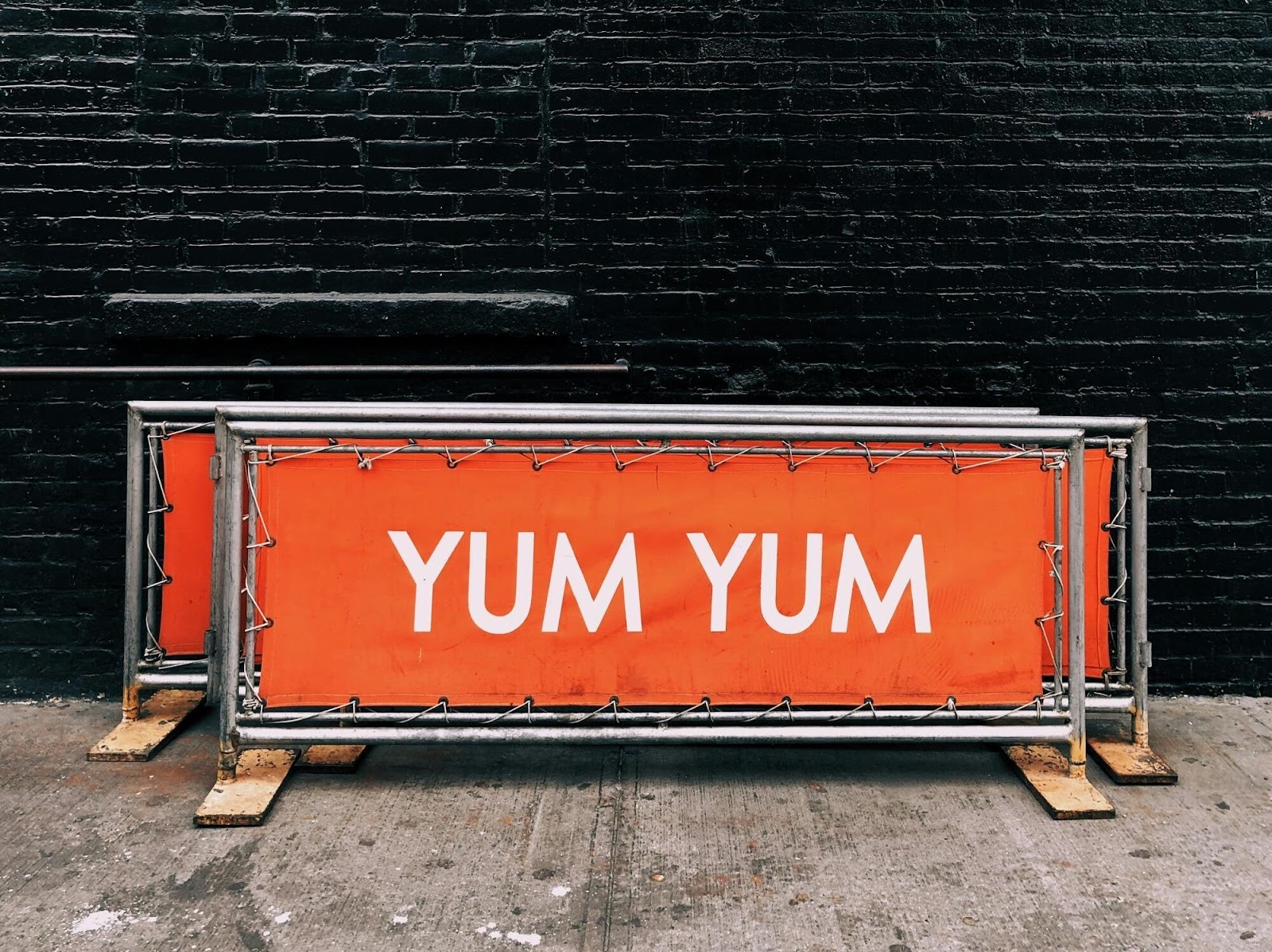
Using Images and Icons to Support Your Message
Images help banners tell stories faster than words. A single strong image works better than many small ones. Photos should match the banner’s purpose and tone.
Icons help explain ideas without extra text. Simple icons feel friendly and easy to understand. Avoid blurry images because they look unprofessional.
High-quality visuals improve trust and attention. Images should not overpower the main message. Placing images carefully keeps the layout balanced.
People notice faces and objects quickly. Using relevant visuals builds emotional connection. Too many images can feel crowded.
White space helps images stand out better. Smart image use makes banners more engaging. Balanced visuals support clear communication.
Making Custom Designs Easy With Online Tools
Online tools simplify banner creation for everyone today. Templates help beginners start without design experience. Drag and drop features save time and effort.
Users can change text, colors, and images easily. Many tools offer ready layouts for different occasions. This reduces stress and speeds up creativity.
A reliable banner creator helps users design confidently. No advanced skills are required to create banners. Simple controls guide users step by step.
Preview options help check designs before sharing. Online tools work well on different devices. They support fast edits anytime needed.
Easy tools encourage creativity and experimentation. Designing banners becomes fun, not frustrating. Accessible tools help everyone create quality banners.
Adjusting Banner Sizes for Different Display Needs
Banner size depends on where it will be shown. Large banners work well for outdoor events and stages. Smaller banners fit online posts and digital screens.
Choosing the correct size keeps text readable. Wrong sizes can make designs look stretched. Always check recommended dimensions before designing.
Digital banners need different sizes from printed ones. Vertical banners suit entrances and hallways. Horizontal banners work well above stages.
Online banners should load quickly and clearly. Resolution matters for print quality. High resolution prevents blurry results.
Proper sizing improves professional appearance. Planning size early saves redesign time. Correct dimensions help banners look polished.
Keeping Designs Simple and Avoiding Visual Clutter
Simple designs feel cleaner and easier to understand. Too many elements confuse viewers quickly. Limiting text helps messages stay focused.
White space gives designs breathing room. Clear layouts guide eyes naturally. Avoid unnecessary decorations that distract attention.
Consistency in style improves visual harmony. Aligning elements keeps banners organized. Simple shapes feel modern and friendly.
Minimal designs work for many occasions. Viewers appreciate clarity over complexity. Clean banners look professional and trustworthy.
Simplicity helps messages stand out clearly. Less clutter means stronger communication. Good design focuses on what matters most.
Final Review Tips Before Sharing Your Banner
Always review banners before printing or posting online. Check spelling to avoid embarrassing mistakes. Confirm dates, times, and names carefully.
Make sure colors look balanced and readable. Test visibility from different distances. Ask someone else to review your design.
Fresh eyes often spot hidden errors. Ensure images load clearly and correctly. Check alignment and spacing consistency.
Preview banners on different screens if possible. Small adjustments improve overall quality. Saving final versions prevents accidental changes.
Careful review shows professionalism and care. Final checks protect your design effort. Prepared banners feel confident and complete.
Learn Easy Banner Design Solutions
Creating the perfect banner does not need to feel difficult. With clear planning, simple words, and balanced colors, anyone can design banners confidently. Custom designs help events feel special and organized.
Using easy tools and templates saves time and reduces stress. When messages stay short and visuals stay clean, banners communicate better.
Reviewing details before sharing improves quality and trust. Simple design choices lead to strong results that people enjoy seeing.
Did you find this article helpful? If so, check out the rest of our site for more informative content.