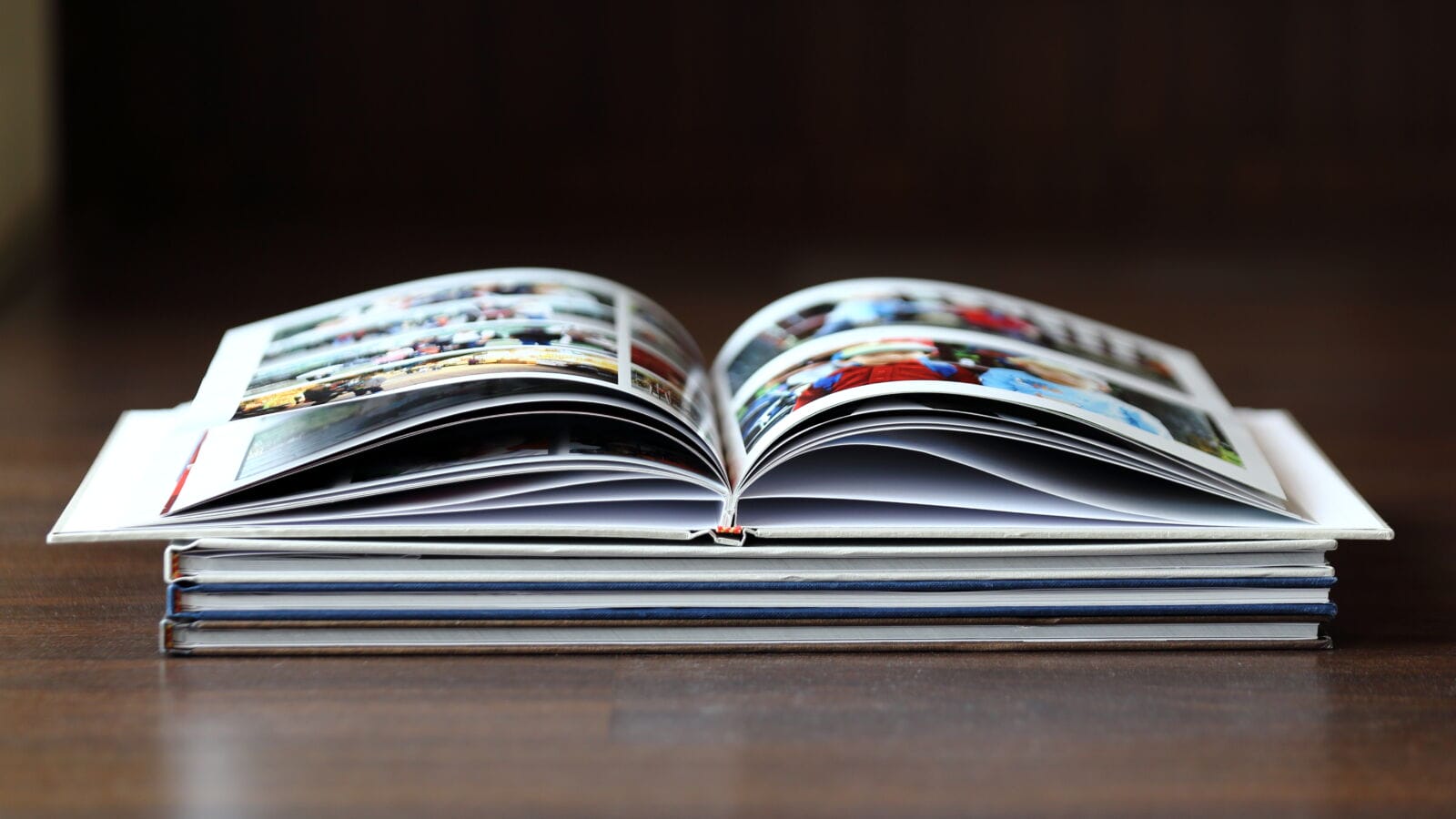
Selecting a theme for your photo book is like selecting the right frame in a painting, as it establishes your mood. In this digital age, you frequently possess thousands of photographs, but there’s no consistent narrative connecting them all.
A sense of the right theme serves as a creative guide, which can influence your layout and help guide what images to showcase. In this article, you will learn how to choose the ideal aesthetic that will give life to your unique story.
Align Your Theme with the Occasion
In choosing a theme, the first thing you need to do is consider what event or time you are documenting. A wedding book often requires a classic, minimalist look to set its style, with plenty of white space and elegant fonts that emphasise a very particular kind of romance. In contrast, a book about a toddler’s birthday party may be richly coloured.
When you start your photo book, don’t forget to match the “temperature” of the theme with your photos. If you spent your summer on the beach, choose themes with sandy tones and nautical textures. Deep blues and silver accents can enhance that magical, atmospheric quality during the winter holidays.
Choose a Consistent Colour Palette
Consistency is the secret ingredient that makes a bespoke album a high-end coffee table book. After you have a feel for what your theme should generally look like, choose a limited colour palette that matches the main colours in your photography. It prevents the pages from becoming visually tiring or cluttered while the viewer flips through your memories.
If your photos are quite full of greenery due to nature walks, choose earthy shades like sage, cream, or soft brown for your backgrounds. A monochrome theme is also an ideal choice for your city adventures to give your book more of a professional, editorial feel.
Select Typography that Speaks
The correct font selection can affect how your audience will see the theme. Books about family history or heritage really appreciate when you use Times New Roman for the classic, authoritative feel it represents. Sans-serif fonts are ideal for modern portfolios and travel diaries, as they have crisper, cleaner lines.
Using too many different fonts in one book can create the appearance of disorganised, messy pages. Use one font for your headings and another for your captions to keep a clear visual hierarchy.
Use White Space Effectively
Everybody wants to fill every inch of a page with their pictures, but white space is actually very helpful. A minimalist theme uses empty spaces to create space for your photos to “breathe”, guiding the viewer’s attention to the most important pieces.
You might run one of these stunning landscapes through a page with a wide white border, emphasising its scale and beauty. This approach makes for a high-status gallery image, one where even a simple picture instantly looks like a professional-grade piece of work.
Incorporate Textural and Graphic Accents
Themes aren’t only colours and fonts; they’re the tiny details of text that create a picture effect and a character that pop out as texture. That could take the form of digital “stickers”, floral borders, or textured paper effects that lend the book a tactile sense of being physical.
If you are planning to take the vintage-centred book approach, you may want to add sepia tones or “weathered” edges to some of your layouts for a true-to-life feel. Simple geometric shapes and map icons will give a modern travel book a sense of movement and direction. What this small thing brings is the final “wow” that gives your custom book its genuine airiness.
Balance Variety and Unity
Keeping your backgrounds in the same colours and fonts while creating diversity in how pages are arranged does not kill variety. Even though it’s structured like a book, it captivates the reader, and the various parts come together to form a cohesive whole.
You would get a page with one entire photo bleeding, and then grid-like entries of many smaller, more candid photos taken on the same day. This rhythmical change in layout sets the stage, as this book never feels predictable while keeping the theme you introduced. It strikes the right balance between a cohesive and thrilling look.
Craft Your Visual Legacy
Choosing a theme is the single most critical creative decision you will make when creating your custom photo book. It gives you the framework and style you’ll need to make a digital folder a beloved physical item on your shelf.
Slowly work through various styles and find the one that reminds you of your personal story. When you decide on a shared theme, you’re basically making an effort to have your cherished memories given the respect they merit.