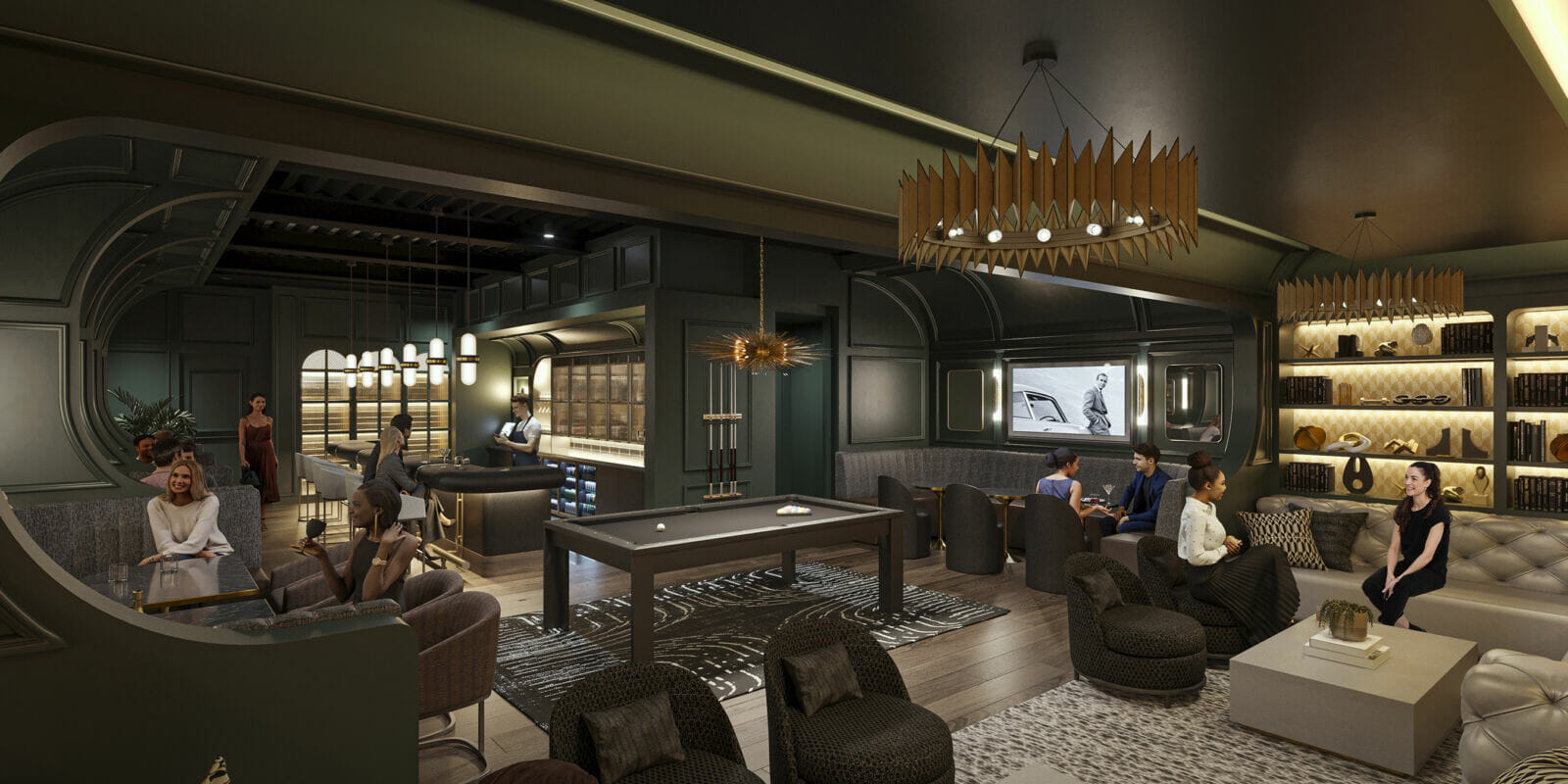
Delving into the subtle yet powerful influence of color in the workplace, we’ve gathered insights from CEOs and psychology experts, among others, to explore how hues shape employee mood and productivity. From the efficiency of metallic tones to the innovative spirit evoked by lavender, this article presents the diverse perspectives of 13 professionals on the psychological effects of color choices in office design. When it comes to the psychology of color and office design, here are 13 insights:
READ MORE: AZ Big 100: 50 real estate companies to watch in 2024
- Metallic Tones Boost Efficiency
- Natural Tones Encourage Balance
- Cultural Differences Affect Color Perception
- Neutral Colors Enhance Focus
- Color Selection Impacts Workspace Function
- Psychology in Colors Influences Emotions
- Blue Hues Promote Tranquility and Focus
- Thoughtful Color Selection Fosters Productivity
- Purple Accents Inspire Creativity
- Green Evokes Rejuvenation and Creativity
- Lavender Fosters Comfort and Innovation
- Light Intensifies Color Psychology
- Different Colors for Different Room Functions
Metallic Tones Boost Efficiency
My experience suggests that the use of metallic tones, like silver or chrome, can add a modern and sleek feel to an office space. These colors often evoke a sense of efficiency and forward thinking.
They are suitable for industries that value innovation and speed, such as technology. However, it’s important to balance them with warmer colors to avoid an environment that is too cold or impersonal.
Mark Varnas, Principal SQL Server DBA and Consultant, Red9
Natural Tones Encourage Balance
We opted for natural tones, like earthy browns and soft neutrals, since these colors promote a comforting ambiance in break areas and communal spaces.
Especially in a law firm, where energy levels are always soaring, this palette cultivates a sense of warmth and balance to encourage social interactions and relaxation during downtime. Similarly, for private offices and conference rooms, a balance of calming blues made team members feel a lot more focused and centered during discussions.
The trick, however, is to complement colors judiciously—you want to avoid overwhelming combinations that might lead to sensory fatigue. Striking a balance between warm and cool tones ensures an environment that’s both visually appealing and motivating for your employees.
Riley Beam, Managing Attorney, Douglas R. Beam, P.A.
Cultural Differences Affect Color Perception
The impact of color varies with geography and culture. This is something I learned because my business is dual-headquartered in Romania and New York.
However, it was very apparent that what worked for calm and focus in one place didn’t necessarily work in the other, because the attitudes toward certain colors and design aesthetics were very different because of cultural influences on color. Blue is not the end-all-be-all for calm and productivity if you’re looking to work internationally.
Dragos Badea, CEO, Yarooms
Neutral Colors Enhance Focus
Neutral, cool colors have helped the workplace become more focused and less distracted. Bright colors and patterns seem to put people on edge. The unsettling effect caused employees to have more conflicts with themselves and with customers.
Neutral, warm colors are a close second, but cool colors seem to lead to better productivity. The effect is immediate. As soon as people walk into a room with calming colors, their demeanor calms.
Michelle Robbins, Licensed Insurance Agent, Clearsurance.com
Color Selection Impacts Workspace Function
It’s crucial to consider the specific needs and functions of different areas within the office when choosing colors. For example, vibrant and energetic colors may be suitable for collaborative spaces or breakout areas, while calming colors may be more appropriate for individual workspaces. Bright and more fun colors are great for inspiration and creativity but can make it tougher to focus and be productive.
Muted colors are more often seen in cubicle-type offices as they help to limit distractions. However, they can cause the mood to decrease, and employees might not feel as inspired or productive either. In addition to this, different colors and how light reflects off of them can affect how you feel in your workspace.
Ultimately, individual preferences can also play a role, so a balance that considers the overall atmosphere and the nature of the work being done is essential. Regular feedback from employees can help determine whether the chosen color scheme positively impacts their mood and productivity.
Daniel Southern, Managing Director, Luminati
Psychology in Colors Influences Emotions
Having different colors in an office can have a significant influence on evoking specific emotional responses and affecting employee mood.
For instance, incorporating red into an office environment can stimulate feelings of energy and urgency, making it an ideal color for spaces where dynamic activity and quick decision-making are needed. On the other hand, blue is known for its calming influence and can promote focus and concentration. Using blue in areas that demand sustained attention or calm can enhance the overall effectiveness of the space.
With this understanding of color psychology, businesses can create spaces that positively influence mood and, as a result, improve their employees’ performance and satisfaction.
Bayu Prihandito, Certified Psychology Consultant, Life Coach, and Founder, Life Architekture
Blue Hues Promote Tranquility and Focus
Color psychology plays a significant role in office design, influencing both employee mood and productivity. One specific insight is the impact of blue hues in the workplace. Blue is often associated with calmness, stability, and mental clarity.
Incorporating various shades of blue into an office environment can foster a sense of tranquility and focus, which is beneficial in spaces where concentration and mental acuity are essential. For instance, using lighter blues can create a serene atmosphere, reducing stress and promoting calmness.
Darker blues are linked to increased productivity and improved focus, making them suitable for task-oriented areas like meeting rooms or individual workstations.
The psychological effect of blue extends beyond just a sense of calm; it can also influence cognitive performance. Research suggests that blue environments can enhance creative thinking, problem-solving abilities, and brainstorming sessions. This effect is useful in creative industries or roles that require innovative thinking.
Nilou Esmaeilpour, Clinical Director and Registered Clinical Counselor, Lotus Therapy
Thoughtful Color Selection Fosters Productivity
Colors in office spaces wield a significant influence on the overall atmosphere and productivity of employees. Bright and vibrant colors like yellow or red can infuse energy and creativity into collaborative areas, encouraging interaction and sparking innovation.
Calming tones such as blue or green are conducive to a sense of calm, tranquility, and focus, making them ideal for individual workstations or areas requiring deep thinking. Neutral tones like beige or gray create a professional and adaptable backdrop, fostering a sense of simplicity and sophistication.
It’s important to strike the right balance between colors; while a pop of bold color can inspire, an overload might lead to distraction or gaudiness, emphasizing the importance of thoughtful color selection to promote a harmonious and productive work environment.
Nicole Moughrabi, Marketing Coordinator, Achievable
Purple Accents Inspire Creativity
Purple has a unique psychological impact that is frequently disregarded in office design. Shades of purple can inspire creativity and inventiveness, besides their regal associations. According to research, purple can help people think creatively and solve problems more effectively.
It can encourage staff members to tackle problems from a different angle by introducing discreet purple accents across the workspace. The introspective associations of the color can also help to calm the mood and improve concentration.
Maintaining equilibrium with neutral colors prevents you from overpowering the room. Utilizing the psychological depth of purple in office color schemes can help create a workspace that not only exudes sophistication but also fosters an attitude that encourages original problem-solving and increased productivity.
Durgesh Maurya, Marketing Manager, IGP.com
Green Evokes Rejuvenation and Creativity
I’ve noticed that incorporating the color green into office design can influence employee mood and productivity. Green is associated with nature and has a refreshing effect on the mind.
Being surrounded by this color brings a sense of rejuvenation and promotes creativity, resulting in improved motivation and productivity.
Gillian Perkins, CEO, Startup Society
Lavender Fosters Comfort and Innovation
My understanding is that the color lavender has a unique effect in an office setting. It’s known for its calming properties, similar to blue, but also has a touch of warmth, which can foster a sense of comfort and creativity.
Lavender can be especially effective in creative industries or spaces designated for brainstorming and collaboration.
Stephen Hasner, Managing Partner, Hasner Law PC
Light Intensifies Color Psychology
The way colors affect us in office design is intriguing, especially when considering how they interact with natural light. Take blue, for example. In a well-lit space with lots of sunlight, bright blue walls can bring about feelings of calmness, focus, and creativity, boosting concentration for tasks needing mental clarity.
However, if the space lacks natural light, those same blue shades can appear darker and colder. This can make the atmosphere feel gloomy, leading to fatigue, low energy, and possibly a drop in morale. Productivity might take a hit in such an environment.
Catherine Cooke, Co-Founder, Upskillwise
Different Colors for Different Room Functions
Colors wield significant power over employee mood and productivity. Bright and vibrant hues like blue and green promote a sense of calm and focus, fostering a productive atmosphere. These colors are known for reducing stress and enhancing concentration, contributing to a positive work environment.
Warmer tones, such as yellow and orange, evoke feelings of energy and creativity, stimulating mental activity. However, it’s crucial to strike a balance, as overly bold or monotonous color schemes can lead to distraction or monotony.
You can assign different colors to rooms for different purposes. Experiment with bright colors for break rooms or solid accent walls with deep colors for meeting rooms.
Pascal Culverhouse, Founder and Managing Director, Electric Tobacconist


