Small design tweaks with a big impact: 18 design details for your home
Small changes in home design can transform a space without requiring a complete renovation. This article explores eighteen practical adjustments that make rooms feel more polished and functional, backed by insights from interior designers and home improvement professionals. From lighting upgrades to hardware swaps, these strategies prove that attention to detail delivers measurable results.
FOOD NEWS: 10 celebrity chef restaurants to try in Arizona
THINGS TO DO: Want more news like this? Get our free newsletter here
- Introduce a Full-Height Divider
- Layer Lighting for Comfort
- Use Warm Soft-White Bulbs
- Pick Simple Matte Frames with Glare-Free Glass
- Switch to Dimmers in Shared Rooms
- Set Artwork at Gallery Height
- Favor Floor and Table Lamps
- Build a Kid-Friendly Resources Wall
- Mount Diffused Flat Panels Overhead
- Camouflage Outlets and Cover Plates
- Add a Slim Entry Shelf
- Raise Curtain Rods to Elevate Ceilings
- Upgrade to Soft-Close Hinges and Slides
- Replace Cabinet Knobs and Pulls
- Select Large-Format Marble Tiles
- Adopt Multifunctional Storage Furniture
- Install LED Strips for Indirect Glow
- Refresh Paint Trim and Railing
Introduce a Full-Height Divider
In my apartment, the primary living space is a large, open-plan area that serves as the central hub of the home. From this space, a hallway leads directly to the master bedroom. When the bedroom door is open, there is an uninterrupted line of sight into this highly private area. In interior design, the importance of sight axes is often underestimated, yet they play a crucial role in how spaces are perceived in terms of privacy, harmony, and spatial quality.
To address this, I installed a floor-to-ceiling wooden room divider within the master bedroom to interrupt the direct view and create a clear visual boundary. While its initial purpose was to block the line of sight, the intervention achieved far more than functional privacy. The introduction of wood significantly elevated the refinement and warmth of the space, emphasizing craftsmanship and the inherent quality of the natural material.
Beyond its aesthetic value, the room divider now acts as a visual guide, subtly extending the pathway into the master bathroom. This creates a more fluid and intentional transition between the bedroom and bathroom areas, enhancing spatial coherence and comfort. As a result, the divider not only improves privacy but also enriches the overall architectural narrative of the apartment.

Layer Lighting for Comfort
One design detail that’s made the biggest difference in my own home — and consistently in the homes I stage and redesign — is layered lighting. Like many homes, mine originally relied heavily on overhead lighting, and while it worked, it never felt especially warm or inviting. I started noticing the same issue elsewhere as well, especially in my neighborhood, where very bright, cool LED overhead lights are common. They’re efficient, but they can feel stark and overstimulating, and that really stayed with me.
That’s what pushed me to rethink how lighting functions in my own space. By adding table lamps, floor lamps, and softer accent lighting, my home immediately felt more comfortable and intentional. It’s not just about how it looks, but how it lives and how I use the space — being able to adjust lighting depending on the time of day or what I’m doing has made the space far more functional. It’s a simple change, but it completely transformed how my home feels on a daily basis.

Use Warm Soft-White Bulbs
Honestly, one of the smallest changes that made the biggest difference in my home was switching out the lighting temperature. When we first moved in, everything had bright, cool-toned bulbs that made the space feel harsh and a little sterile, especially in the evenings. I swapped them for warm, soft-white bulbs and added dimmers in a few key rooms, and it completely changed how the house felt.
The rooms instantly became more comfortable and lived-in, and it made a noticeable difference in how we actually used the space — we started lingering longer in the living room and dining area instead of feeling like we were under office lighting. It didn’t cost much, but it improved both the mood and functionality of the home in a way I didn’t expect until I experienced it day to day.

Pick Simple Matte Frames with Glare-Free Glass
I made a small change that really paid off: I switched to simple, matte frames for the prints in my place. The cleaner look stopped the frames from competing with the pictures and really let them stand out, which changed the feel of the whole space. It also brought a nice consistency, tying different rooms together in a natural way. Plus, the non-reflective glass cuts down on glare, so the pictures look great no matter the time of day. That simple switch made the house feel more put-together and peaceful, almost like a quiet continuation of the landscapes I like to photograph.

Switch to Dimmers in Shared Rooms
The switch of standard switches to dimmers for shared spaces within my home was a small detail that has a big impact. Initially I thought it was just cosmetic, but it changed how the spaces operated at different times of the day. Dimming the lights at night created a much more inviting, relaxed and purposeful atmosphere, whereas increased brightness during daytime allowed the space to be used functionally. I could see that guests would spend longer in the room and feel more at ease in the setting rather than feeling overwhelmed. Furthermore, this resulted in a reduction of additional lamps needing to be added which simplified the overall layout. Ultimately it is clear to me that an adjustment to the lighting would enhance the mood and usability of a space without needing to make drastic changes.

Set Artwork at Gallery Height
I lowered my artwork. Most people hang their art way too high. I used to do it too. I had framed prints floating closer to the ceiling than the furniture. It made the ceilings feel lower and the furniture look disconnected from the walls.
I took everything down and re-hung it so the center of each piece was exactly 57 inches from the floor. This is gallery standard height.
The difference was immediate. The room felt grounded. The art suddenly related to the sofa and the chairs instead of just floating in space. It didn’t cost a cent, just a few new nail holes to patch. It’s a simple rule, but it makes your home look curated by a professional rather than thrown together. It connects everything in your line of sight.

Favor Floor and Table Lamps
For me, this was investing in floor and table lamps rather than relying on overhead lighting for rooms. It was a pretty minor shift all things considered, but having more ambient light that’s not as bright or focused as overhead lighting tends to be made a huge difference in terms of how warm and inviting rooms feel. Having lamp light, especially in winter when the days are short, has really helped rooms throughout the home feel more like spaces I want to spend time in.

Build a Kid-Friendly Resources Wall
We built a “resources wall” right next to a desk and a big open table, and it changed the entire rhythm of our days. Open shelves, clear jars, labeled bins, sketchbooks within reach, scissors that are not mysteriously migrating to a drawer three rooms away. The idea was simple: if a child can see it and reach it, they can start without asking. Within a week the tone shifted from “what can I do?” to quiet rustling and little projects appearing on the table. Pencils got used to nubs. Glue sticks finally lived long enough to tell their story.
Functionally it killed two birds. The space looked calmer because everything had a visible home, and learning became easier because there was no hunt before the work. We keep a few anchors on rotation, like a tray for current interests and a small pegboard for tools, then let the kids curate the rest. The best surprise was how it nudged self-governance. They plan, they tidy, they return. I still get invited to admire a cardboard city or a very serious graph about biscuits, but I am no longer the keeper of the tape. That one wall did more for independence than any timetable I have ever drafted.

Mount Diffused Flat Panels Overhead
That happened also in my own home. One small detail that completely changed the space was the replacement of ordinary ceiling pot lights with flat LED panels with built-in diffusers. On paper, it is like a small thing, but the effect was huge. The light now evenly spreads across high ceilings, twelve feet, without strong shadows, without that sharp and harsh feeling which often standard lights give. Instead of that, the room got a soft and even glow, like in a gallery or a modern arranged studio.
This small detail really changed the space and the function. Visually the diffusers highlighted modern arranged wall panels. The view at the ocean, but without glare. Everything looks cleaner, calmer and more elegant. LED panels last much longer and use much less energy, which is ideal. I like to spend time with my friends and guests. The ambience is now perfect without any effort.
In the end, that small change made the space feel more luxurious, warmer and professionally arranged, just like the best homes that I present to my clients. That was proof that sometimes one simple detail can lift the whole house to a completely new luxury in the sky.

Camouflage Outlets and Cover Plates
A minor design element that has a huge impact in my house is the matching of the wall outlet plates and the switch covers to the wall color, rather than leaving them white. Most households consider outlets as an addition, but they seem to interfere with the views more than expected, particularly when there are clean walls or natural light in the room. Bringing visual noise. Painting or matching plates with colors eliminates any distraction as lines of furniture, artwork, and architectural design can maintain attention. The space is less chaotic and more purposeful despite the impossibility of the majority of visitors to spot what is different at a glance.
The actual benefit also manifests itself in functionality. Interrupted walls are less comfortable to feel and less easy to place furniture as well as to photograph the spaces, and this is important whenever a home is used as a workspace or a socialization place. I have been known to remark, that good design is no addition, but the lack of friction, and this little change confirms me every time someone enters the room, and spends very little time noticing how he or she comes to feel at home without any explanation.

Add a Slim Entry Shelf
Doorways don’t get much respect, but I have a theory that the most overlooked trick for instantly improving any house is also the cheapest: install a threshold shelf. Right inside the front door, hang a skinny fixed ledge about 30 inches off the floor and 24″ wide, only as deep as your wallet is thick. Keys. Phone. Sunglasses. Drop them there. No drawers. No baskets. Just a plain old slab, maybe worth $45 in materials. Think of it like a fulcrum point for your brain…that strip of wood is where “outside” becomes “inside”. You walk through the door wrestling groceries, a beverage, mail stuffed in your pocket — it throws everything down on that shelf and voila!
Such a simple detail, but it honestly sets the tone for the whole house. Walk in your door, set it down. Your mind will follow. Clutter disappears. Stress evaporates. Sure, you can build out $1,500 worth of custom cabinets & shelves to achieve this nirvana, but quite frankly one little floating board next to your front door will do more for your transitions than 90% of your furniture.

Raise Curtain Rods to Elevate Ceilings
An important home interior design detail that greatly impacted my space was raising my curtain rods several inches above the window frame. I found that by doing this, I not only created the illusion of elongated walls and taller ceilings but also let in significantly more natural light when the curtains are drawn back. Even though I haven’t replaced or rearranged any of my furnishings, the room appears much larger without feeling confined.
I also noticed a significant improvement in how well the room photographs and receives light throughout the day; there is a noticeable increase in air circulation when I open up the windows. By taking this simple action, I learned that there was much more to the way a room feels than just how you decorate a room; the position of an item can greatly affect the way it feels and functions within any given space.

Upgrade to Soft-Close Hinges and Slides
One small design detail that made a surprisingly big difference in my home was switching to soft-close cabinet hinges and drawers in the kitchen. It sounds almost insignificant, but it completely changed the feel of the space. The gentle close eliminates that occasional slam, which instantly makes the kitchen feel calmer and more “high-end.” It also reduced wear and tear, so things look newer for longer. The functionality upgrade was subtle but noticeable quieter, smoother, and more enjoyable to use and the overall aesthetic feels more thoughtful and refined.

Replace Cabinet Knobs and Pulls
Swapping out old cabinet hardware is a simple project that delivers a surprising amount of value.
Dated knobs and handles make a kitchen look older than it is, but replacing them with clean, modern pieces gives the room an instant lift. It costs very little compared to a full renovation and requires almost no skill to install.
This approach works so well because it blends function and style (at a low cost).
You are improving how the cabinets feel to use while giving the space a fresher look. For homeowners trying to update a home on a budget, this is one of the smartest moves to start with.

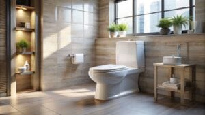
Select Large-Format Marble Tiles
Choosing large format stone tiles always elevates the design of a home. The vast majority of homes contain ceramic tile, especially subway tile backsplashes. A marble backsplash always stands out, and when you choose large format, there is less grout, therefore less maintenance.
In addition, the smallest details make the biggest difference in homes. Ornate or unique light switches, updated hardware such as knobs, drawer pulls, and cabinet pulls, crown molding, wainscoting, and mirrors. One of these details alone is not much, but combined with a great design, the room is greater than the sum of its parts.

Adopt Multifunctional Storage Furniture
You’re really hitting two birds with one stone when you make the most of multifunctional furniture — it keeps things organized while saving room and preventing clutter. When you have beautiful furniture pieces that double as storage, you’re making the most of your square meters while keeping things stylish! My favorite examples are coffee tables with storage, extendable tables (great for entertainers who live in small places), TV consoles with storage, wall beds that fold up into a cabinet wall, and the classic storage ottomans.

Install LED Strips for Indirect Glow
Adding led lights under cabinets or on the top of the cabinets for indirect lighting has really changed the feel of my kitchen. It highlights darker spaces which makes the home feel more modern.

Refresh Paint Trim and Railing
There are a few small design details that really made a difference in my home recently. The first was painting my interior to be a refreshed neutral. Painting is a simple way to make a large impact on your home. It also allows you a fresh start with editing and hanging art. The second thing I did was to update my trim throughout. A taller, colonial trim, painted in a fresh white. The third thing I’ve recently done in my home was to update the stair railing and balusters to a simple wrought iron. These three recent changes have really made a large impact on my home.