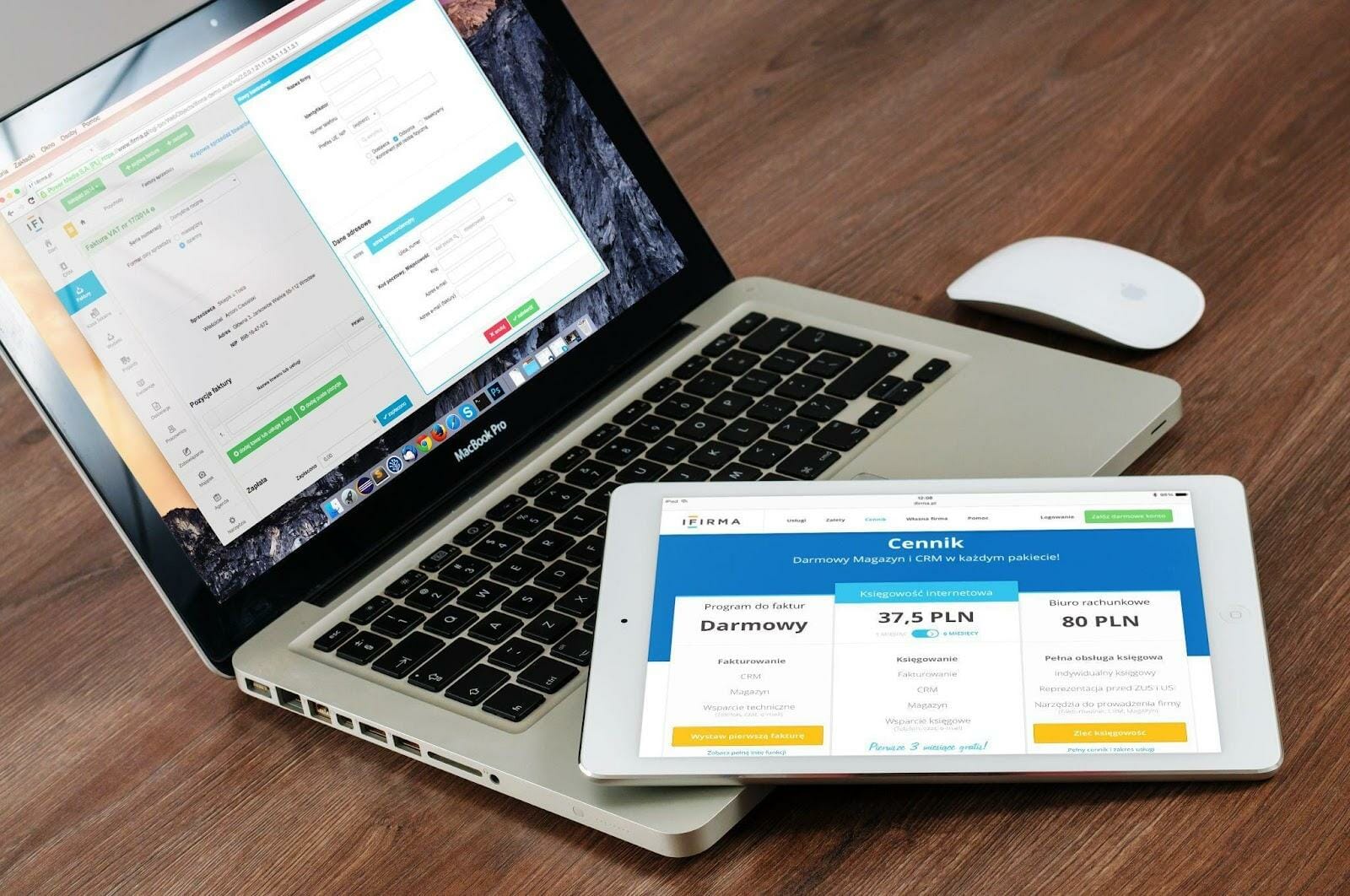
A landing page is one of the essential parts of your website and plays a vital role in converting visitors into customers. Landing pages have different components, and each one must be perfectly designed if you want them to achieve its goal.
How do you get these parts of your landing page correct?
There are no right or wrong ways to build a landing page. It depends on the objectives you need to achieve. The good news is there’s plenty of quality help to get you going in the right direction if you know where to look.
And now that you’re here, I will walk you through essential parts of a landing page that will help you improve conversions and begin seeing results immediately.
1. Header
The header of a landing page is the first thing you see when someone lands on your website. It’s typically the most prominent part of the page because it contains all the information you need to get the user’s attention and make them want to click through.
Because this is such a large area, you should ensure that it’s clear and easy to read. Some people like to include their logo in the header, but this can be distracting if there are other elements on the page that could blend into it.
Finally, include keywords in the header so that Google will crawl and index it.
2. Hero
The hero section is where most of your copy will go and where any images or video you want to show off will go. Here, you should focus on what makes your business unique, how it solves a problem or offers something new that other businesses do not offer, and why it matters to visitors.
Since this contains the bulk of your landing page content, you’ll also need to ensure it isn’t cluttered with multiple elements so that there’s room for everything else on your page (and for the user) to breathe.
An excellent way to do this is by using this tool to create landing pages, especially if you’re just starting out with one for your business and looking for a plug-and-play system that works.
3. Benefits
The benefits section lets you share your product’s most significant benefits with customers. For example, if you’re selling a service, the benefits section could include what it will do for your customers’ bottom line, like saving them money and making their lives easier. Or, if you’re selling a product, the benefits section might share how great it makes people’s lives look or feel.
In this section, don’t just share one benefit; give readers multiple reasons to choose over your competitors. For example, if there’s only one thing you can do for your customers that no one else can, then tell them exactly that in this section — but don’t stop there! Give them more than one reason as well.
4. Social Proof
One of the most powerful things about social proof is that it shows readers why they should trust you and your brand. It’s a way to show that your business has already been vetted by other trusted businesses and people who have already bought from you before.
People are more likely to use other people’s recommendations when making purchases online — especially if those recommendations come from people who have used the product themselves. In your case, social proof means showing off other customers who have bought your product or service and telling potential customers that they will love it too.
5. Call to Action
The call to action (CTA) is the most crucial part of your landing page. It’s what people will click on, and it will determine whether or not they stay on your site and take action. And since we’re here, here’s a quick look at what makes a good CTA and how you can use it to improve your conversions.
The Clarity of the Message
CTAs are part of the many tools for making your landing page stand out and gaining more leads for your website, but you’ll need to be precise when constructing them.
Doing this will help users know what they’re clicking on and make them more likely to click on it. It also helps to use short, easy-to-read copy and images that are consistent with the rest of your landing page.
An Element of Urgency
Urgency is a crucial element when it comes to CTAs. If you want people to click on a CTA quickly and easily, you need to make it seem urgent enough that they will immediately take action.
The best way to do this is by adding an element of urgency into your copy — something like “Click this button now!” or “Only 100 people left” — so that it sounds like there won’t be time for them to think about whether you’re worth it or not before taking action.
Takeaway
There’s no magic recipe or template for creating the perfect landing page, but we can offer some guidance that will help you create pages that deliver results.
Of course, you’ll have to experiment and see what works best, but as long as you keep in mind the information we’ve covered here, you should be off to a good start.


