Travel-inspired rooms feel personal without trying too hard. A map on the wall can nod to places you love, places you plan to see, or simply the idea of curiosity at home.
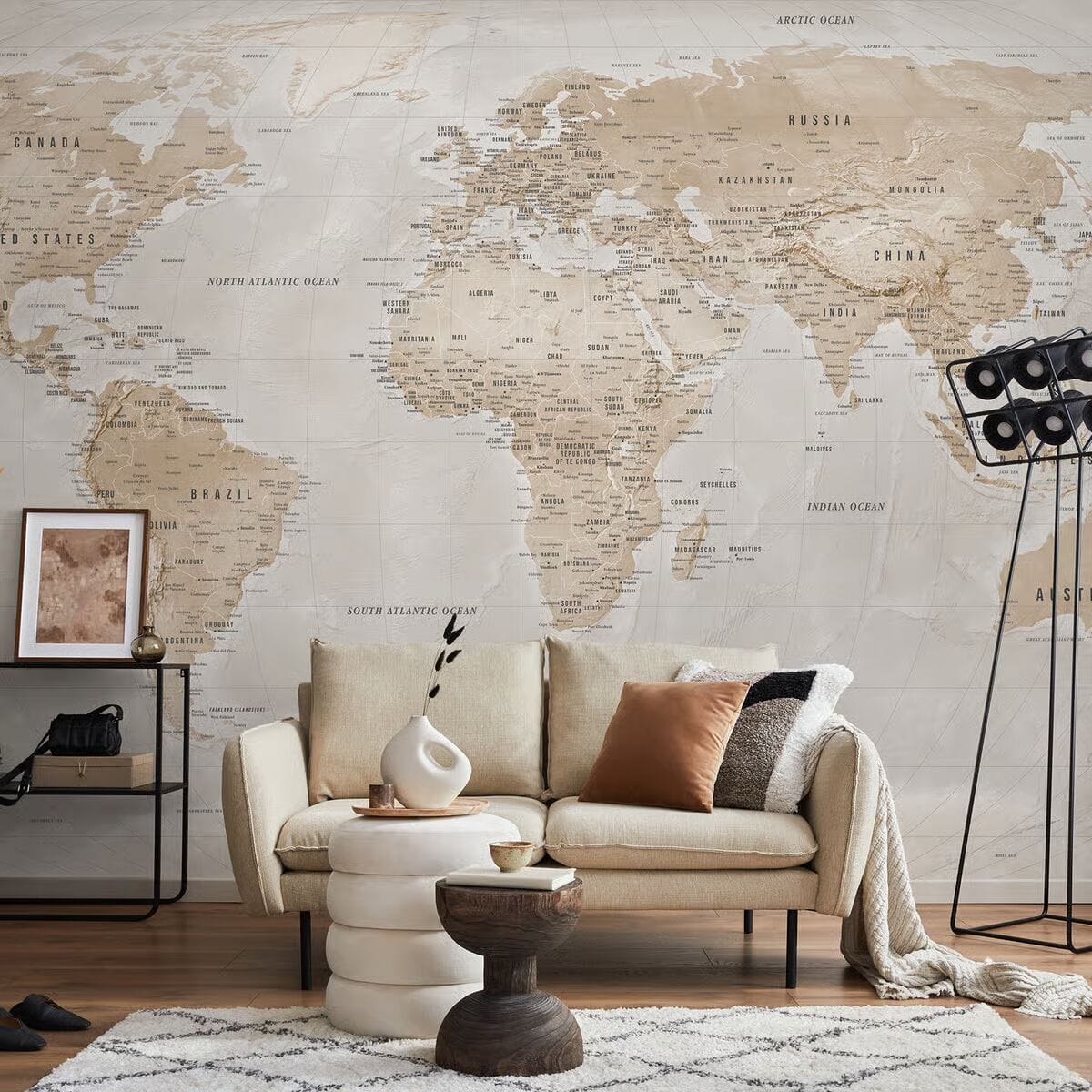
If you want a focal point that ages well, map wallpaper is a strong choice. It works best on one feature wall in spaces where you can enjoy the detail without making the room feel busy.
Why Map Wallpaper Is a Popular Interior Design Trend
Map designs have staying power because they add meaning as well as style.
- They create a clear focal wall without relying on loud colors.
- They bring “story” into a room, even with simple furniture.
- They suit both modern and traditional interiors with the right print style.
- They can replace extra wall art, which helps small rooms feel calmer.
- They invite interaction, since people naturally lean in and look closer.
Types of Map Wallpaper for Different Styles
Choosing a map starts with the mood you want. Some maps feel collected and historic. Others feel crisp and graphic. Large murals can feel almost cinematic.
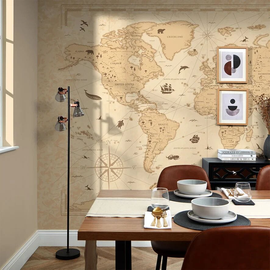
Vintage Map Wallpaper
A vintage map look feels warm and layered. It often includes parchment backgrounds, distressed edges, and classic typography. This style pairs well with walnut, brass, and textured fabrics like linen and wool.
Use vintage maps when you want the room to feel cozy and lived-in. Keep the rest of the palette quiet so the wall does not compete with heavy wood tones.
Minimalist and Modern Map Designs
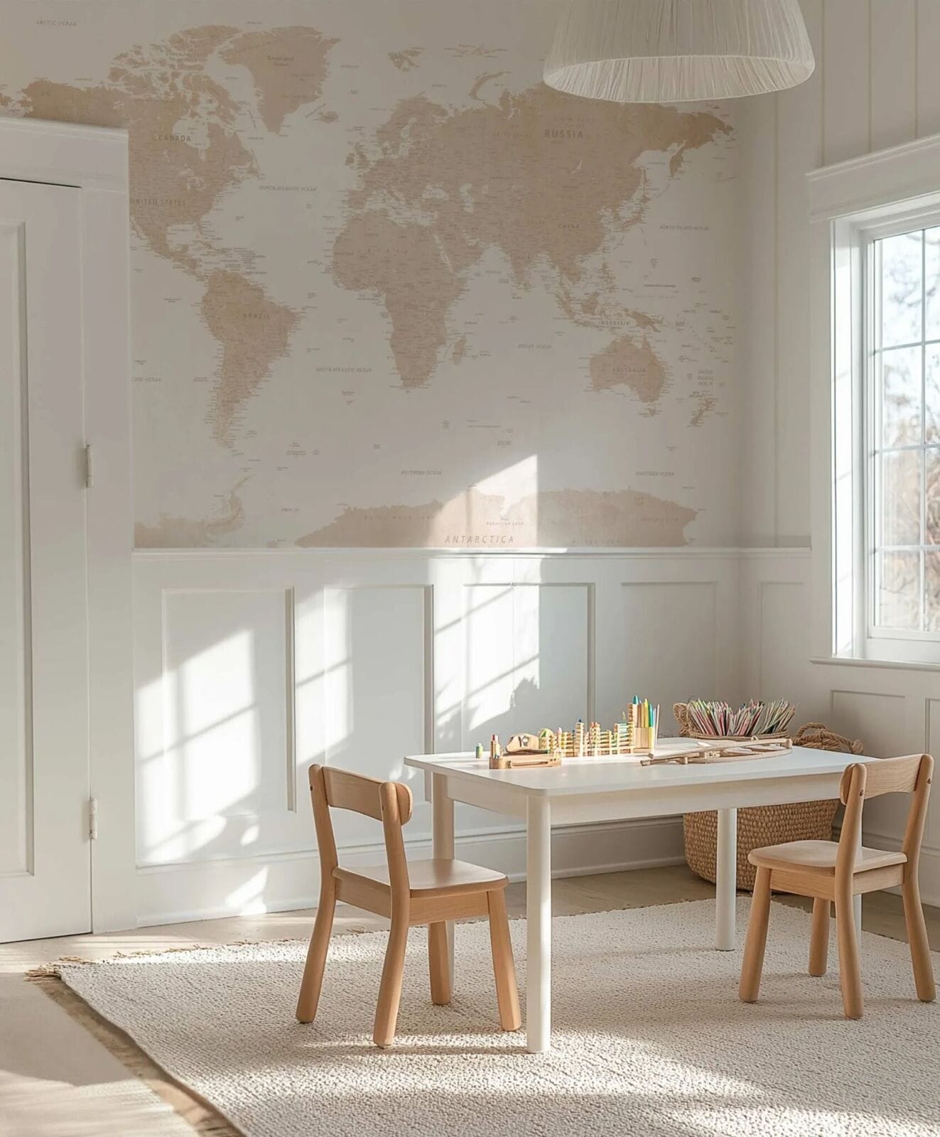
Modern map designs feel cleaner and more edited. Lines look sharper. Backgrounds stay lighter. Labels and borders often look simplified. This style fits contemporary rooms because it reads like graphic art.
A modern map works best with neutral furniture and restrained accessories. If you want the wall to feel calm, choose a print with more negative space.
Large World Map Wall Murals
Large murals create instant impact, especially on a long wall. They work best when the viewing distance is stable, like across a bed or behind a sofa. For compact rooms, avoid overly dense labels, since fine text can feel busy up close.
If you want an immersive look, choose a mural with soft gradients and controlled contrast. The wall will feel deeper without feeling loud.
Best Rooms to Use Map Wallpaper
Maps can work in many spaces, but they perform best where the wall can act as a focal point.
- Living Rooms: Use one feature wall behind the sofa or fireplace to anchor the seating area. A map wallpaper for living room layout looks best when nearby textiles stay mostly solid.
- Home Offices: A map wallpaper for office setup can look professional and personal at the same time. Keep the contrast moderate if the wall sits behind your camera.
- Kids’ Rooms or Study Areas: Maps support learning and curiosity without looking like classroom décor. A world map wallpaper design with larger shapes often feels calmer in a bedroom.
Styling Tips for Travel-Inspired Interiors
Maps already carry detail. Styling works best when the room supports the wall instead of competing with it.
Pairing Map Wallpaper With Neutral Furniture
Neutral furniture helps the wall feel intentional. Light woods, warm whites, soft grays, and simple shapes keep the space balanced. If your furniture is dark, choose a map with a lighter background so the room does not feel heavy. Keep nearby patterns quieter and let the map carry the visual interest.
Adding Travel Accessories and Memorabilia
A few meaningful pieces beat a shelf full of souvenirs. Choose one or two items that matter, such as a framed photo, a small ceramic bowl, or a book stack from a favorite place. Then stop.
This approach keeps the room curated. It also helps the wallpaper stay the main story instead of becoming background noise.
Choosing Colors That Complement the Map Design
Start with the background tone of the print. Then choose one supporting neutral and one accent color. Repeat that accent in two places, such as a cushion and a lamp base.
If the map reads warm, brass and walnut often look right. If the map reads cool, chrome and light oak can feel cleaner.
Common Decorating Mistakes to Avoid
Map walls look best when the rest of the room stays edited. These mistakes tend to make the space feel cluttered or off-balance.
- Using too many travel objects, so the wall loses impact.
- Choosing a map palette that clashes with the flooring undertones.
- Placing a detailed map on every wall instead of one focal wall.
- Pairing the map with several other busy patterns in the same room.
- Ignoring lighting, which can change the map’s colors at night.
- Picking tiny labels that feel noisy at close range.
- Hanging bold art on top of the map, which creates visual competition.
- Skipping a sample check and being surprised by the scale in person.
Conclusion
Map-inspired interiors work because they blend style with meaning. A well-chosen map wall can add structure, depth, and a sense of story without requiring a room full of décor.
Choose a style that matches your home, keep the surrounding pieces simple, and let the wall do the work. With a thoughtful focal wall, travel-inspired design can feel personal, calm, and timeless.